
Navigation feedback | Out now!
in progress
Katja
I love this new layout! The previous side bar was very big and distracting, I really like that now I have a delicate line at the bottom of the screen. I would only prefer if I could maybe move around the navigation bar but other that that I feel like this is a huge improvement!
[[ suihyou ]]
Hey there, I believe I'm coming up on one year, maybe two, of using Lifeat and I'd like to say I enjoy the new updates and overall cleanup you guys have been doing! My suggestion is to make the bottom nav bar moveable by adding two move buttons on the left and right so people can move them wherever they feel!
My other recommendation is leaving the spaces to the Left Side Nav so the bottom bar is utility only. It makes it more manageable this way!
Sincerely,
[[ suihyou ]]
j
june.studies <3
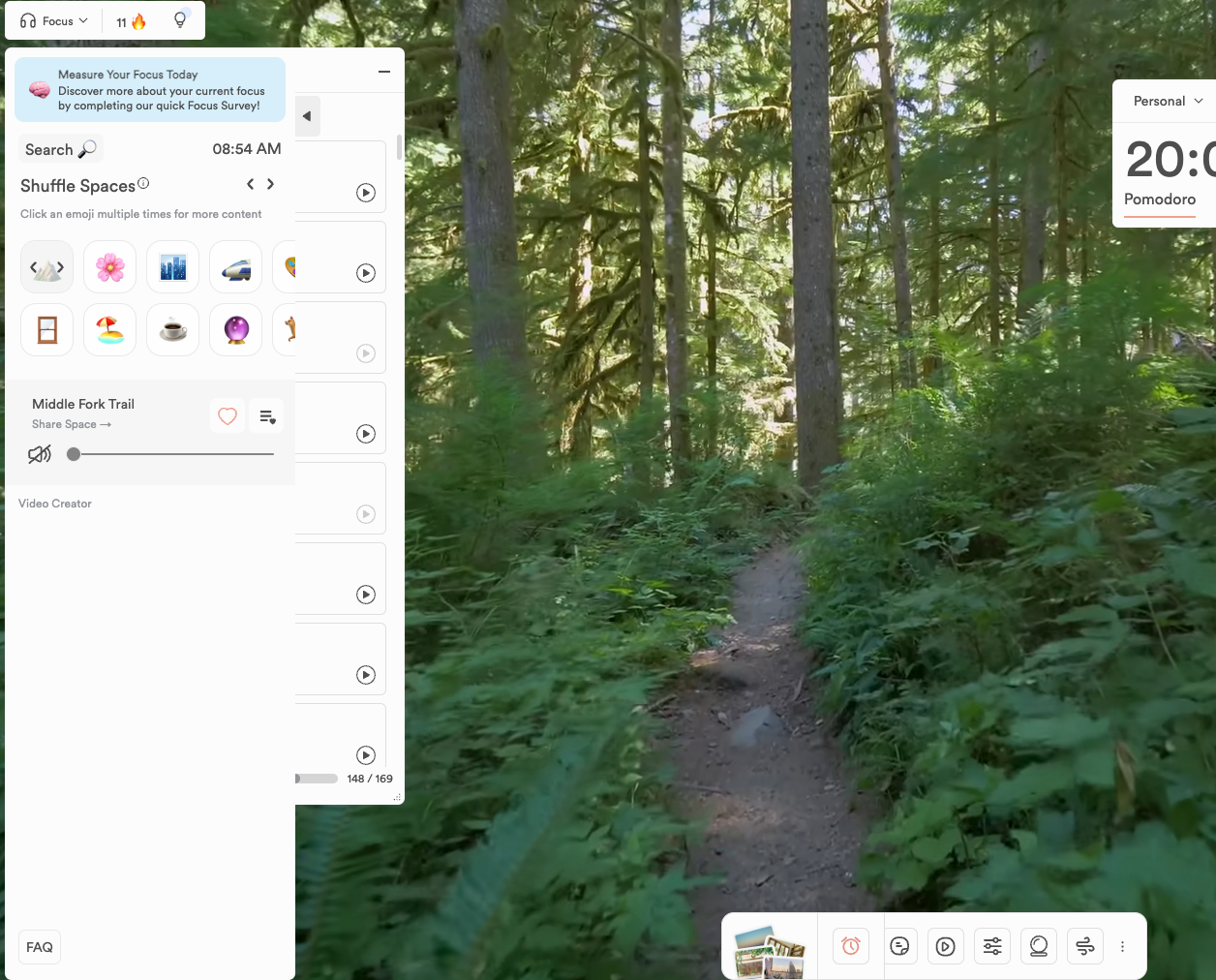
i mainly use lifeat to focus for studying and i honestly don't really like the new layout. it feels everything is scattered around and its honestly quite confusing, unlike before where everything was on the left side of the screen.
the bar at the bottom of the screen doesn't go away even with the full screen option and not only is distracting but also not quite aesthetically pleasing. it would be lovely to have the option to switch between the two layouts, so who prefers the new one can keep it and the others can switch back to the old one.

Rorrie
june.studies <3: Hi there :) You can toggle on Hide Elements by clicking Appearance > Hide Elements from the menu on the top right - see if this helps with the bottom nav sliding out of view for better focusing. And thank you for your thoughts on how we can improve the navigation - we'll take that into account :)
B
Beth H
After using it awhile, I do miss the flow of the side nav overall. In a perfect world, I'd love the option to toggle between the old side nav and a bottom nav! Or move the nav bar around.
Thoughts/comments:
- The ability to empty the screen completely is central to why I use LifeAt, and the (esp. collapsed) side nav did a better job at accomplishing that.
- Side nav (collapsed and expanded) is less visual noise and faster to find and/or make adjustments
- Spaces have the same collapse arrow as before but to re-open you have to go to the bottom nav and that's frustrating. Might bother me more because my usual widgets are only Spaces and Timer, but it introduces friction and I spend more time mousing around the screen.
- The persistent bottom nav is a bit cumbersome in practice, it can't collapse or auto-hide and the scrolling is annoying. If the whole icon bar was open without scrolling and it automatically hid unless hovering over it, I would totally reconsider.
Rorrie
Beth H: Hi there! For hiding the bottom nav, I recommend using our Hide Elements feature - Click Appearance > Hide Elements. This should slide the bottom nav away when focusing. We're working on how to make the Spaces selection a tad more seamless an experience! Thank you for sharing your thoughts :)
B
Beth H
Rorrie Thank you, that is very helpful!
F
Favour Godwin
I personally find it really ugly; visually, the bottom bar just feels too big and and the use of pictures for the spaces icon is just not appealling,it throws of the aesthestic and its just too much in my opinion - the app should stay as minimilistic as possible because we're here to not get distracted. The scroling feature on the bar is also just, really bad, it removes the idea of like quick functionality - like the side bar made everything visible but the bottom bar negates that feature, and it stunts the whole 'navigation' idea. Also i noticed you changed the design for the icons on the navigation bar, the bubbly modern look is, like, too clean? its giving corporation, business meeting not independent work ygm, but idk just my artistc opinion ig
F
Favour Godwin
also the 'reset layout' feature doesnt work
N
Naysha Adukia
I liked the old sidebar better its like the aesthetic got ruined and that bottom bar is really annoying to navigate through and it doesn't look that good either i liked the old one and this new one has made me lose my focus to. You can put an option to switch between the two styles like if you want the side bar or the bottom bar.
F
Faye
The navigation bar on the bottom is very visually distracting for me, to the point where I'm not able to really focus or enjoy using the program. I never had an issue with the navigation on the side, it was very comfortable and intuitive to use. Please at least give us the option of switching between having navigation on the side or bottom. LifeAt has been an invaluable resource for me, and I really appreciate the developers for creating something that has been so helpful and enjoyable to use. However I don't think I'd be able to continue using it with bottom navigation, it's that disrupting for me.
Devin (LifeAt)
Faye We are working on figuring out a better flow. Can you please share how you are using LifeAt today? Ex. Focus vs planner, which widgets do you open, etc.
F
Faye
Devin (LifeAt) I use LifeAt to help me focus throughout the day, whether it's for my business or personal projects. I always use the delta and theta waves on the sound widget, and always use a specific space that helps keep me visually focused. These two widgets have really helped me feel relaxed and focused while working, but that has all been disrupted with the navigation menu being on the bottom of the page, as well as not being able to hide the navigation. It's incredibly visually distracting and I can no longer feel relaxed or focused using the program
d
divya mohan
I like the spirit of the new nav! A few things
- Noticing that when I have multiple widgets open at once that are left aligned, they overlap and I can't move them (screenshot attached). Would be great to have them open side by side
- Would also be great if the nav bar itself was movable a la Zoom video bar! (e.g. based on my current set up my laptop screen is blocking that part of my monitor. A Me Problem for sure but one of many reasons to want flexibility around the nav location I imagine!)
- I'm getting used to recognizing what all the icons mean at first glance but I'm sure I'll grow accustomed to them in time
Thanks for all the work to make the app more sleek and focus-oriented!
Rorrie
divya mohan: Hello~ As a note, for the widgets, can you open them one by one and click the top of the widget, then drag it somewhere you can see on screen? I recommend closing the Calendar widget, then opening the Task widget & dragging it over to the right by grabbing it from the top bar :)
<
<><
I personally prefered the side bar for navigation as it felt better to use, maybe make an option in the settings to pick if you want the bar to be at the side or bottom so everyone can pick which one they prefer.
Rorrie
<><: Can you tell me a little more about why you prefer the left sidebar? :) I'm adding it to our feedback debrief & would love to know more of your thoughts
S
Starlett16
I love the new navigation! It feels more simplified and allows more focus on the space or planner depending on what you use by having less on the screen. A recommendation though is to make the calendar and spaces tool a movable window too (like tasks, notes, etc). A comment I saw is that the side bar makes those options closer to the buttons that activate them, so a way to solve this would be to make them movable as well! Otherwise, I love it, and prefer this to the sidebar!
Rorrie
Starlett16 Great solution for our Cal/Spaces - so make them their own widgets? 💭
S
Starlett16
Rorrie Yep basically! I saw that someone else commented that having the navigation bar be movable too is a good idea, and I want to second that!
Load More
→